Python 培训(数据科学)pyplot 二维图形
示例
- pyplot 模仿 matlab 的画图语言,所以基本上是差不多的,很容易上手,先展示几个简单的代码。
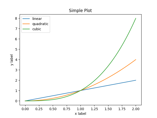
x = np.linspace(0, 2, 100)

#	label 表示图例文字,比较方便
plt.plot(x, x, label='linear')
plt.plot(x, x**2, label='quadratic')
plt.plot(x, x**3, label='cubic')

plt.xlabel('x label')
plt.ylabel('y label')

plt.title("Simple Plot")

#	添加图例
plt.legend()

plt.show()
import numpy as np
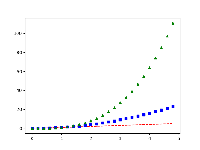
t = np.arange(0., 5., 0.2)
# 设置颜色、记号、线形的方法相同
plt.plot(t, t, 'r--', t, t**2, 'bs', t, t**3, 'g^')
plt.show()
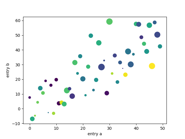
data = {'a': np.arange(50),
        'c': np.random.randint(0, 50, 50),
        'd': np.random.randn(50)}
data['b'] = data['a'] + 10 * np.random.randn(50)
data['d'] = np.abs(data['d']) * 100

#	同样有 scatter 等画图方法
plt.scatter('a', 'b', c='c', s='d', data=data)
plt.xlabel('entry a')
plt.ylabel('entry b')
plt.show()
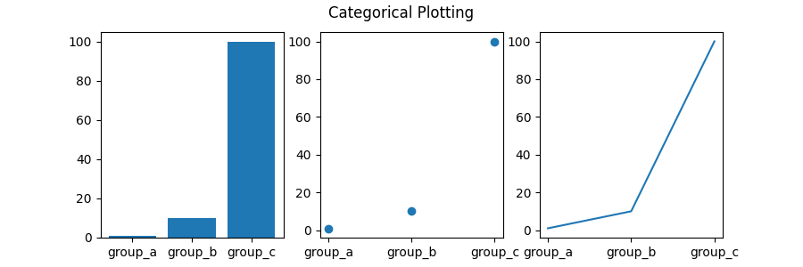
names = ['group_a', 'group_b', 'group_c']
values = [1, 10, 100]

plt.figure(figsize=(9, 3))

#	subplot 可以是三位数,就是省略了之间的逗号
plt.subplot(131)
plt.bar(names, values)
plt.subplot(132)
plt.scatter(names, values)
plt.subplot(133)
plt.plot(names, values)
plt.suptitle('Categorical Plotting')
plt.show()
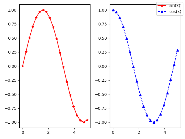
import matplotlib.pyplot as plt
import numpy as np

x = np.linspace(0, 5, 20)
y = np.sin(x)
z = np.cos(x)

#	subplots 可以直接返回 fig 和 ax
fig, (ax1, ax2) = plt.subplots(1, 2)
ax1.plot(x, y, 'r*-', label='sin(x)')
ax2.plot(x, z, 'b^--', label='cos(x)')

fig.legend()
fig.show()

#	保存图片需要调用函数
fig.savefig('test.png')
恼火之处
- 看起来似乎和 matlab 差不多,但是又个地方很恼火,就是如果 subplot 或者有过个 fig 的时候,用 plt 的函数会很迷,不知道是在哪个 ax 上进行操作,而且还有修改坐标等操作都会比较麻烦。
- 如果你上网查找,会发现很多操作都有很多方法,比如可以 plt.plot 也可以 ax.plot,这就是问题的关键了,我们只需要尽量使用 ax.plot 这样指定位置的函数,就可以让代码变得清晰很多。
- 所以,我们画图的时候,尽量慢慢积累如何用 fig、ax 这些来画,尽量不要直接调用 plt,这样熟悉了以后才能流畅地随心所欲地画图。
图库
- 想知道 plt 支持哪些图?官网:https://matplotlib.org/gallery/index.html#mplot3d-examples-index
- 每个图都有例子,需要的时候看一下就会了。
本文章使用limfx的vsocde插件快速发布